Friday, 1 April 2011

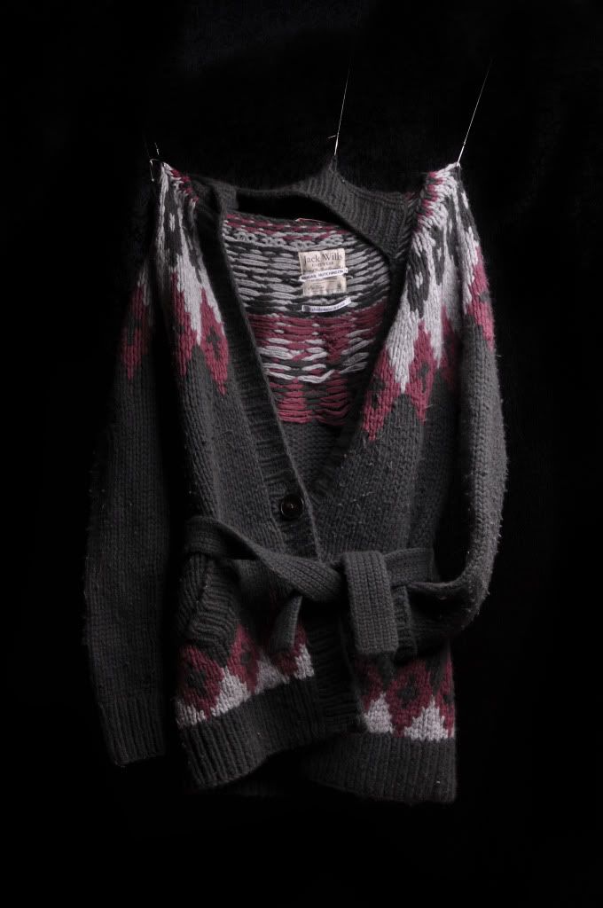
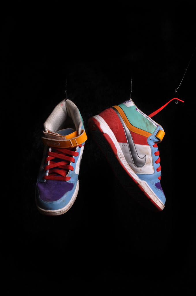
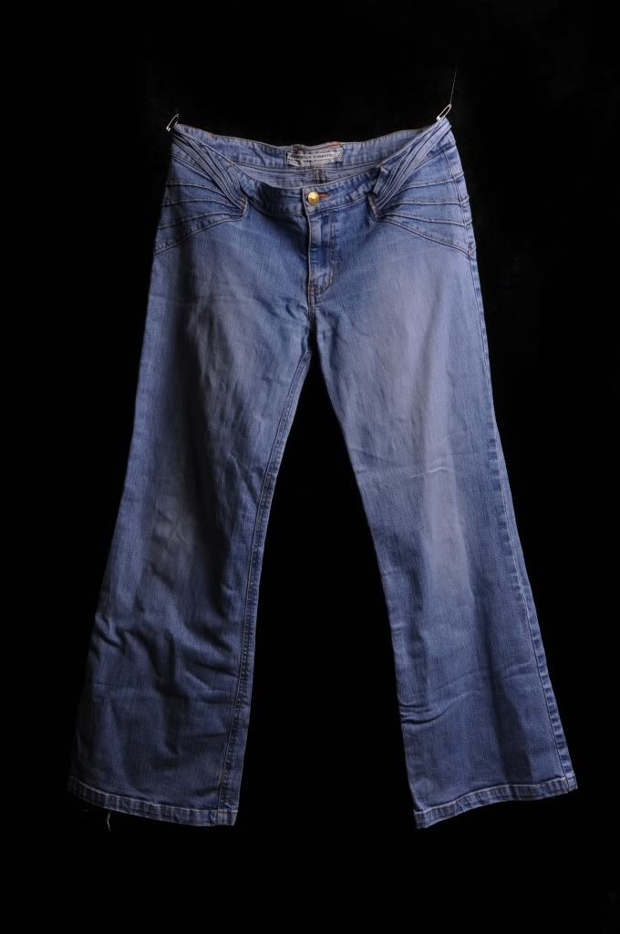
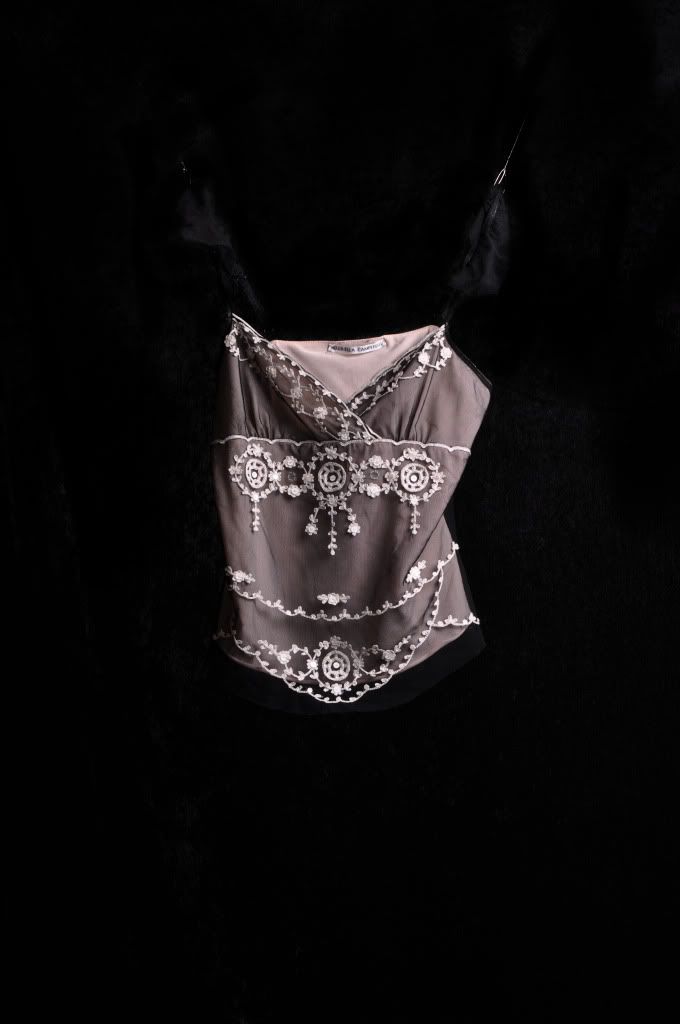
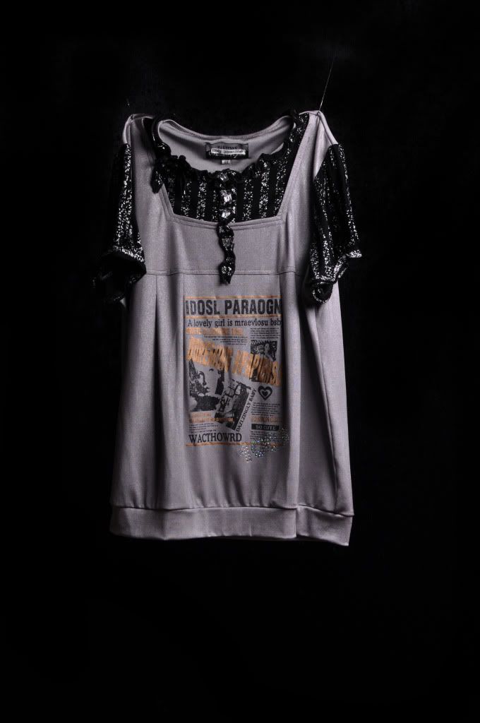
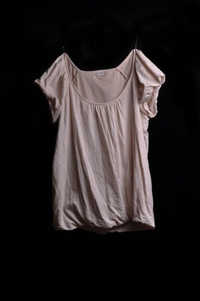
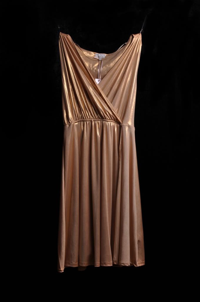
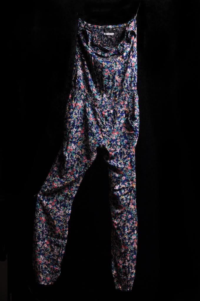
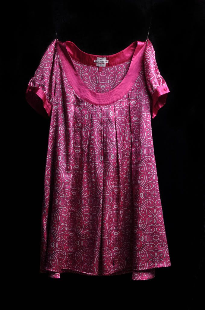
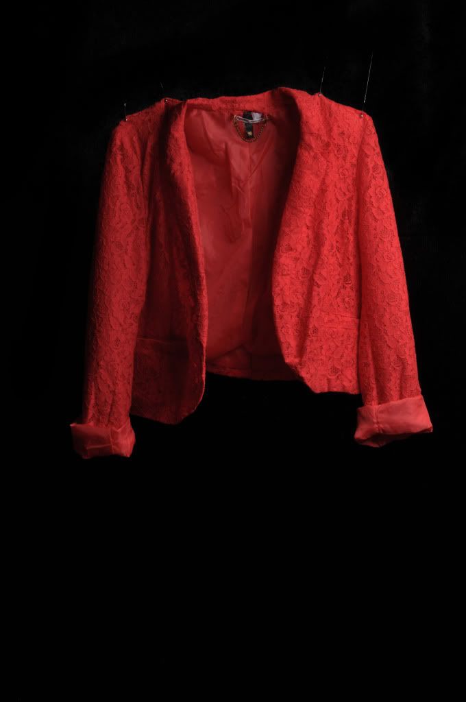
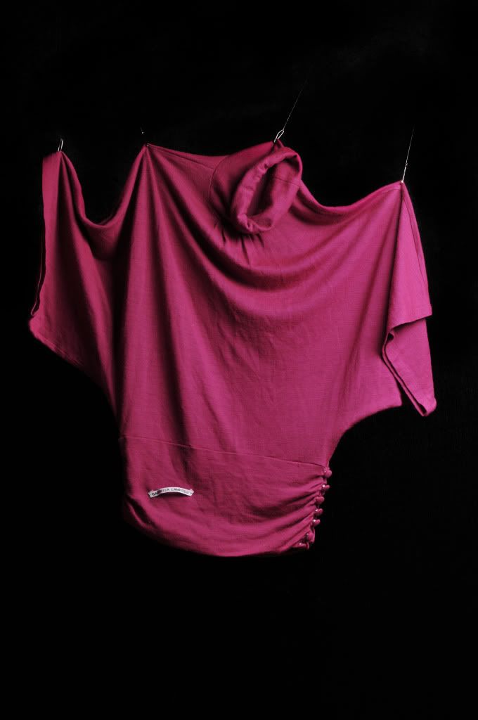
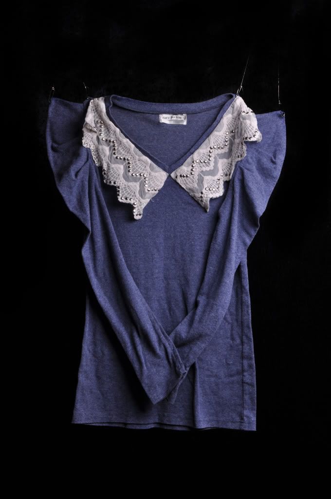
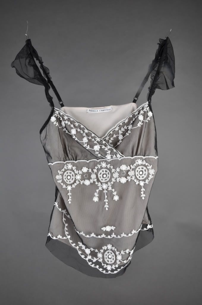
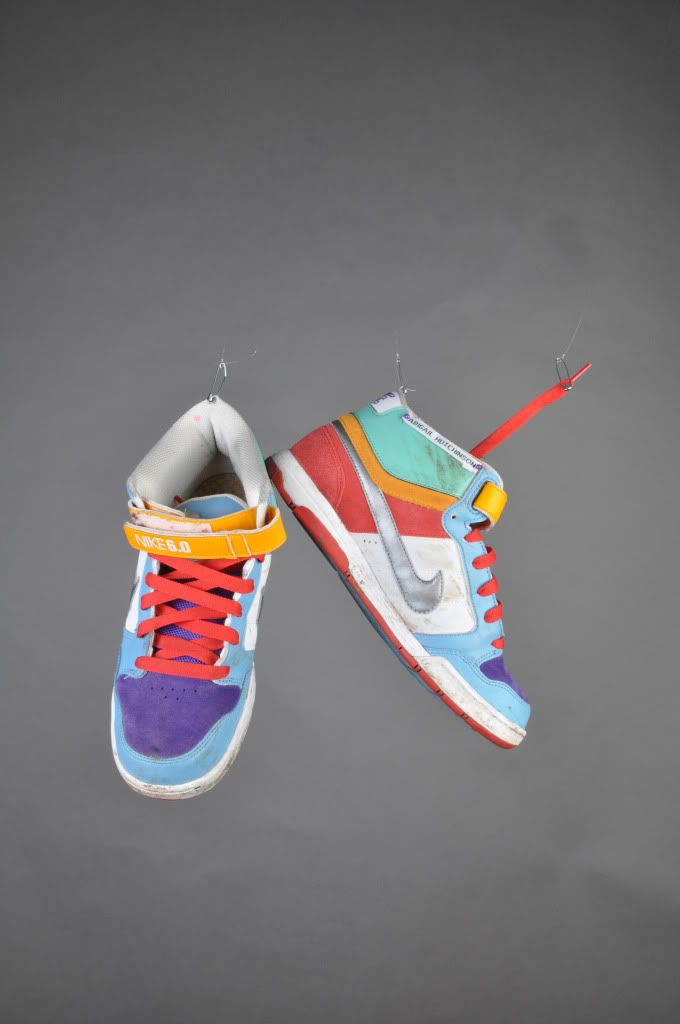
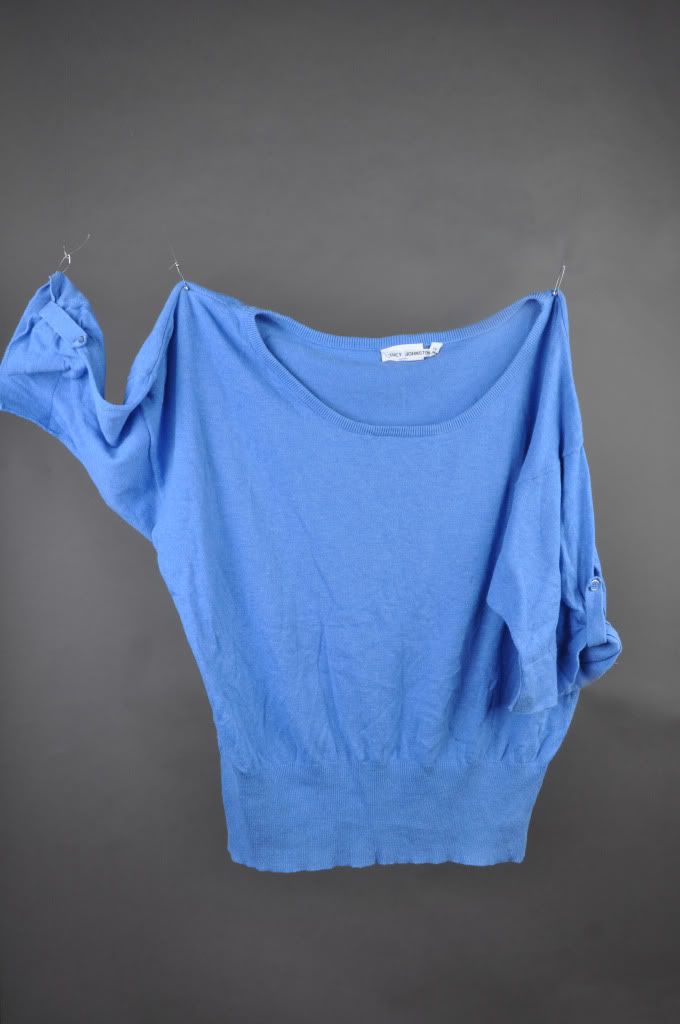
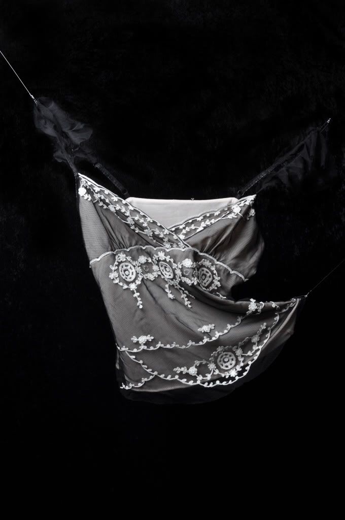
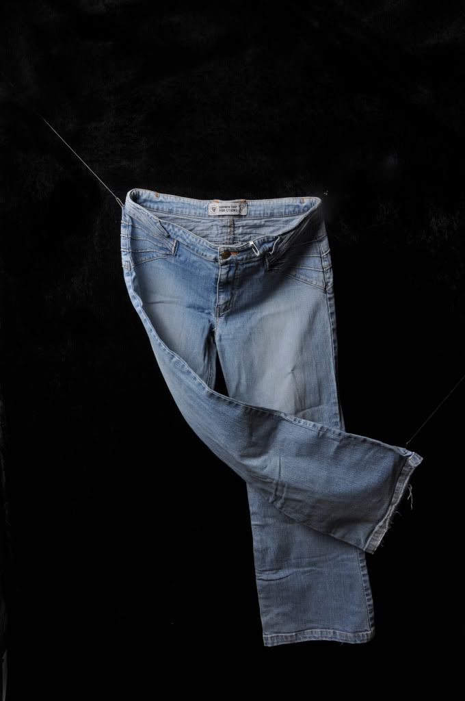
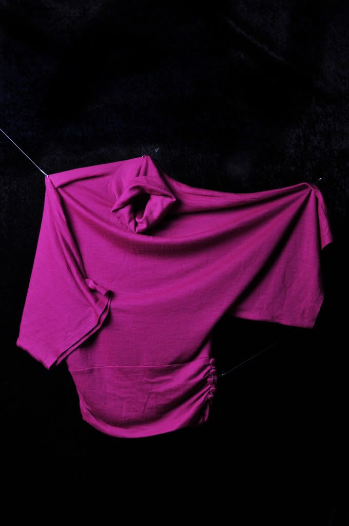
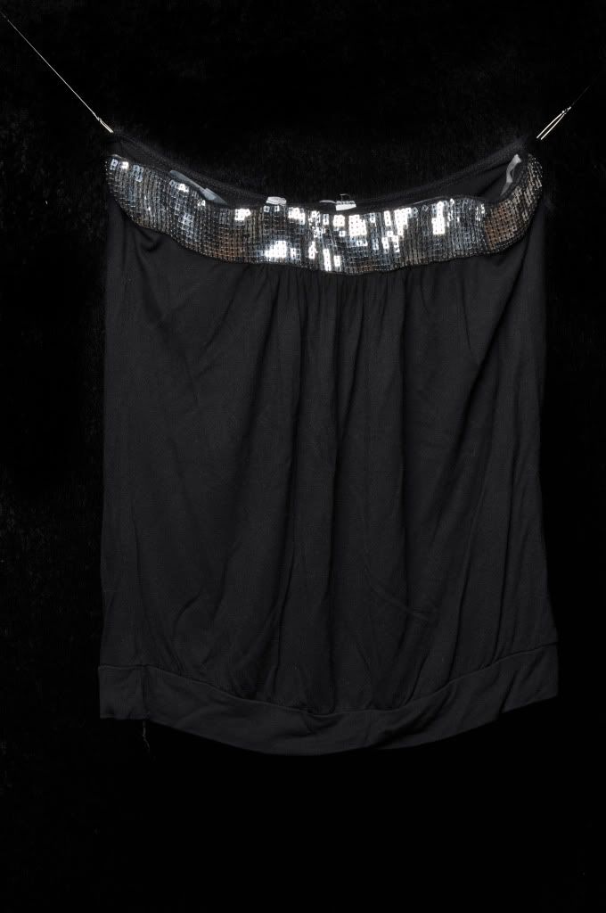
Current possible finals.

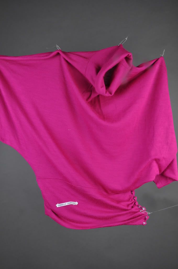
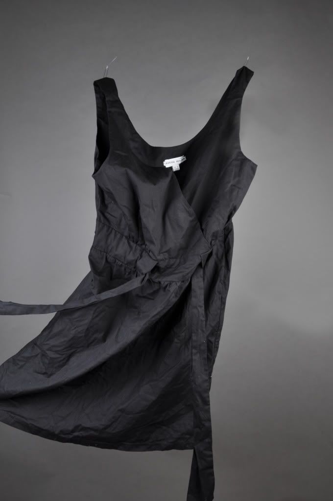
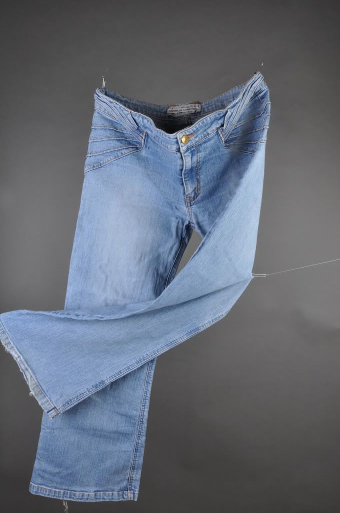
At the moment I have two items of clothing from each person, three in two cases. I'm hoping the crit will help narrow down which ones I should have as my final five. I'm going to print them out at around A2 size, which looked pretty decent on a basic print out I did of some of the previous images I have shot.

But overall I'm pretty chuffed with the quality, I just need to spend the rest of the weekend working on the text to go with them because I feel that it's pretty important to anchor the concept in that way.
I know the dyptychs are different widths apart but it's not for presentation, it's because I'll be printing them out A1/0 sheet at a time and it's easier to put them together. Obviously they won't stay like this because I need to pick certain ones.


© Ruth Johnston 2011.

Thursday, 31 March 2011

And then suddenly, it was basically over.

So, I think somewhere on my memory card are my final images for this project and I have no idea how this happened. After lame a background change to changing back, I'm suddenly ready to buckle down academically again and let my creative side lay dormant.
I have no problem that this has happened because it makes what I need to do over the Easter holidays a whole lot easier, all I have to do now is preview everything and print off some samples for the 'Final Crit' on Tuesday, should be easy.

I'm relieved. It's like a weight has been lifted off my shoulders, once again I fear my coursemates will think I'm a nerd. I don't deserve this after the drunken wreck I was on Tuesday night and the Tuesday night previous. I guess I just can't help what a undeniable genius/amazing Photographer I am... *sarcasm*
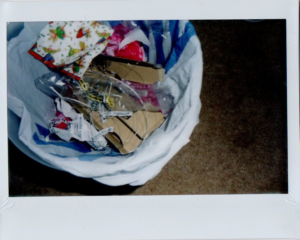
An Instax shot of all the name labels and sharp and hurty pins in the bin, hurrah!

Monday, 28 March 2011

Grey test.

I hate following advice when I was perfectly happy continuing with the way I was going, but here is my test shoot using a grey backdrop with the name labels pinned into the clothing.

I'm unsure how I feel about this. I need to get on with writing some text so I can give a better idea of how the series will work.


© Ruth Johnston 2011.

We'll see what they say...
I have to say I'm disappointed with the current set-up overall now though because initially I was using one light on the lowest setting to light from above but I am now needing to use two, otherwise the backdrop looks shadowed and stupid. I think it's something to take up in the tutorial tomorrow. I'm unsure as to whether these are beginning to look too clinical or like bad product shots..

Sunday, 27 March 2011

Winchester.

So, I've been taking my IXUS around with me because my bag has been feeling a bit heavy, so I thought that I would give my shoulders a break.
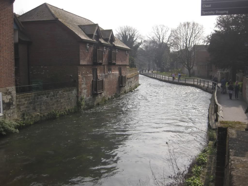
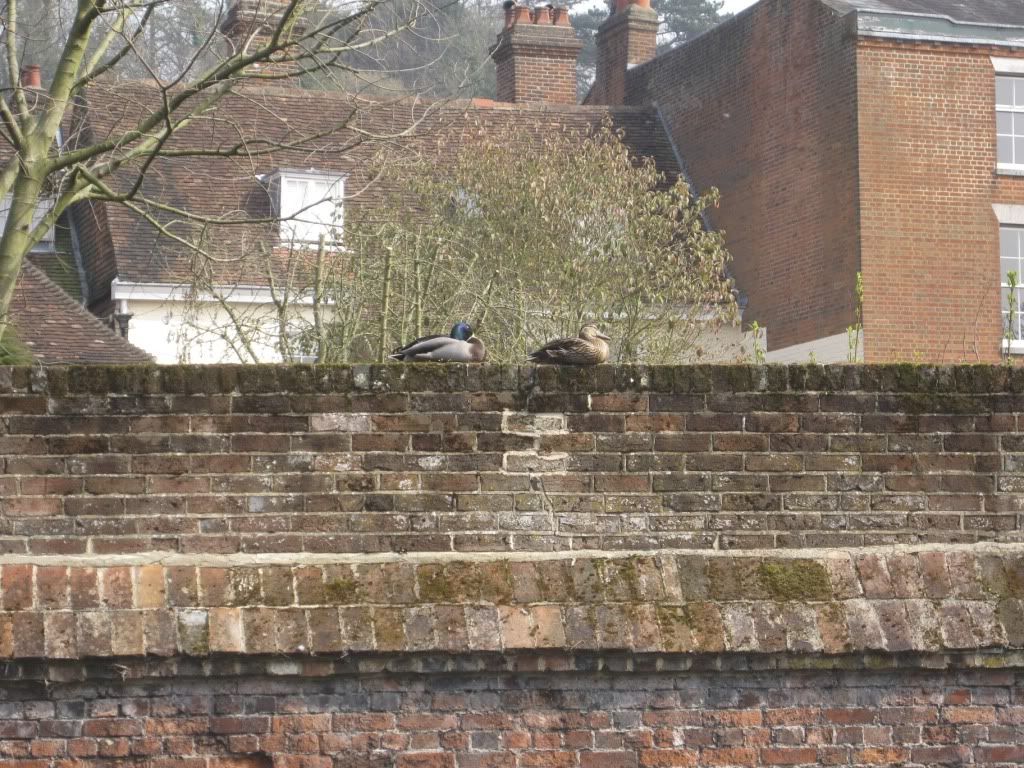
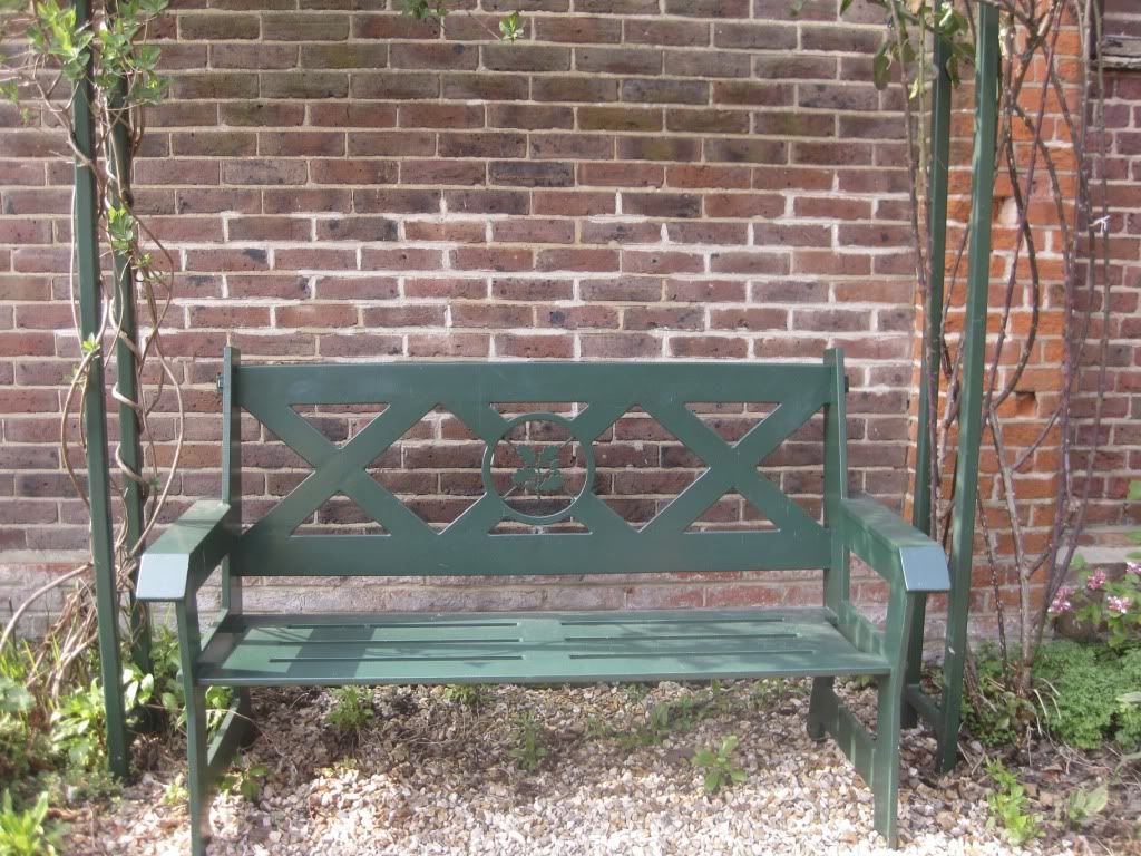
Moon drove me to Winchester yesterday and we had a look around, it's a really nice city and I really liked it, it was so nice just to get out of Portsmouth for a few hours.
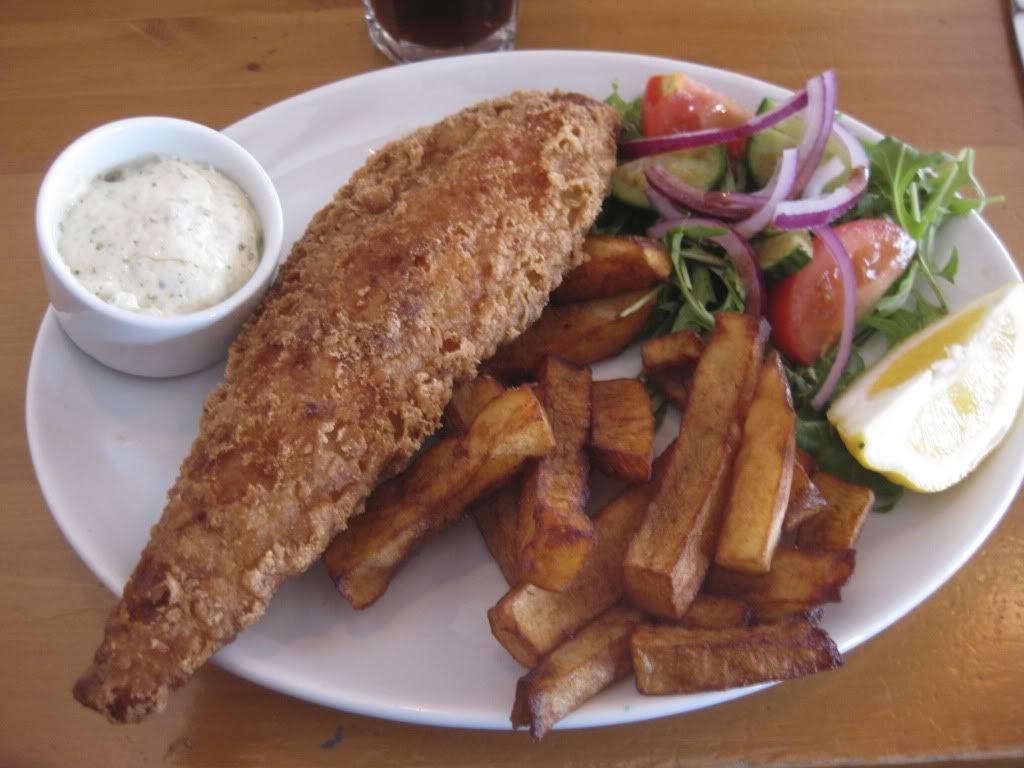
We went and got lunch at this pub called, Alfie's which looked like a dive both on the inside and out, but the food was the best pub grub I've had in ages. I had wanted to have lunch by the river, but as it was so warm, most places with outside seating were packed.
On the way home we stopped off at Ikea to see if I could get any fabric to use as backdrops for my project — which is still pestering me by the way, I just need to get a move on - but it was so expensive. After leaving Southampton the SatNav took us via 'The Range', which also appeared to sell textiles - no luck though - it's the strangest shop. It sells everything you could think of but nothing you really want. Our Kindersurprises were disappointing, so I do not rate The Range very highly.


© Ruth Johnston 2011.

I'm still plodding on with this 'Non-identity' clothing project, but now I've been told that it's 'too dark', despite essentially being about rejection. I know that rejection and the connotations associated with death are separate but neither are subjects that can be illustrated lightly. I was also just proud of the lighting, so I don't know how to change it and keep nice lighting by taking away this 'darkness'. I'm going to try out a load of new backgrounds tomorrow and see, but ultimately I'm happy with the black, I'm just unhappy with the criticism. I think it just needs text to lighten it perhaps, because some of the stories that go with the garments do border on the absurd.

Monday, 21 March 2011

More clothes: project progression.

Here are my favourites from yesterday before my light started threatening to kill itself.


© Ruth Johnston 2011.

So as you can see the velvet is definitely working better, although I'll admit to a bit of cheeky editing, but a very minimal amount. I really love the lighting and I think the eeriness is coming through. I was particularly pleased when visiting speaker and ex-student, Tim Bowditch said they reminded him of Danny Treacy's 'Them', which I suppose is ultimately similar to what I want to achieve.

I prefer these to the previous ones - except perhaps the boobtube - because they are a lot cleaner, but I'm going to have to take out a light from uni and work with that. However, Elemental are getting UPS to pick up the broken light tomorrow, so all my complaining wasn't for nothing. I will be writing long and stern emails to every company I look upon ill-favourably from now on.

You might also like: